CITY PUPS
Overview
People living in cities have a lot to consider when adopting a dog. Limited space, size, & other lifestyle factors create a unique set of needs to make sure that both owners & pups are set up for a happy & healthy life together.
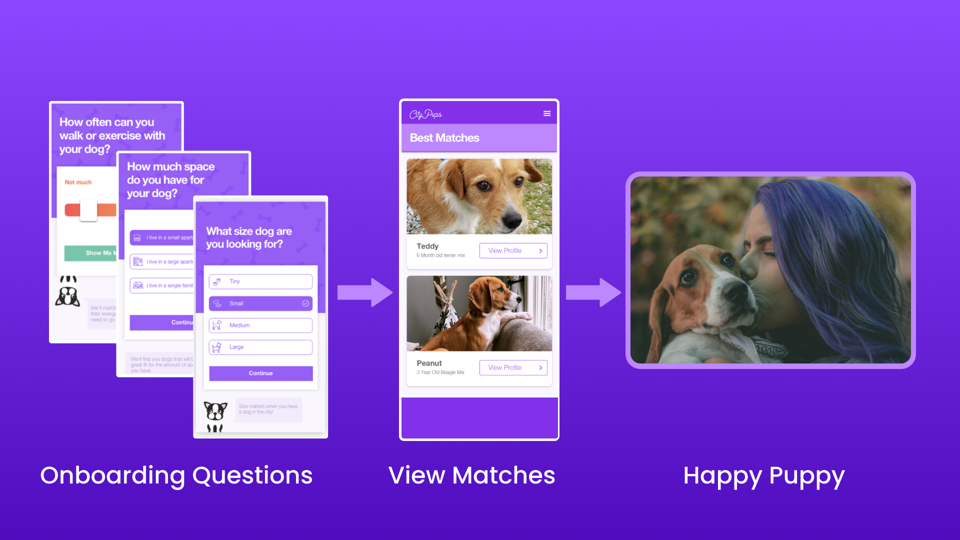
CityPups is a mobile app that helps people living in cities find the perfect dog to adopt.
Project Outcome
I referenced the user interview with Chelsea in order to improve the adoption onboarding experience by:
- Putting myself in Chelsea's shoes to figure out missing details
- Displaying info based on Chelsea's (first-time dog owner) needs
My Role
UX UI Designer
Time Frame
1-day workshop (August 2023)
Background & Usability Testing
How the App Works
Testing the Experience
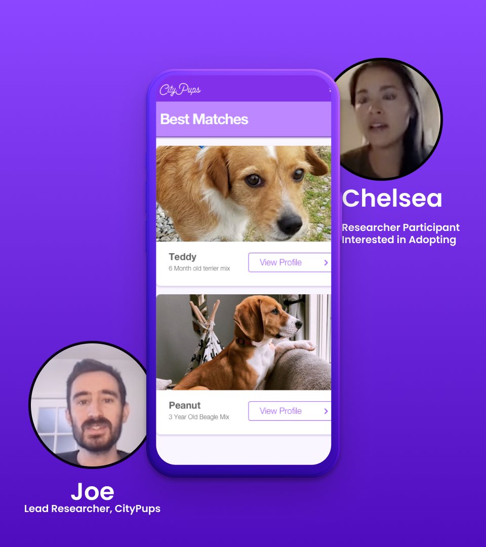
Chelsea lives in New York City & is interested in adopting a dog for the first time. Does CityPups help her find a dog that matches her needs?
During the workshop, I observed Chelsea walking through the onboarding experience & documented key findings as listed below:
What Went Well
- Different filters (such as size) narrow down matches
- Dog icons at the bottom of the screen add personality to the app
What Needs Improvement
- Chelsea is unable to select more than one option
- She would like there to be more details & options with her being a first-time dog owner
- Doesn't feel confident that her matches would be right for her
Quotes
- Chelsea wants to figure out what dog would be best for her lifestyle
- Wants more details & questions on all the options
- "Being able to better filter to get a more curated match"
- "Having more confidence in knowing the dog I'm committing to bring into my home is a good fit for me"
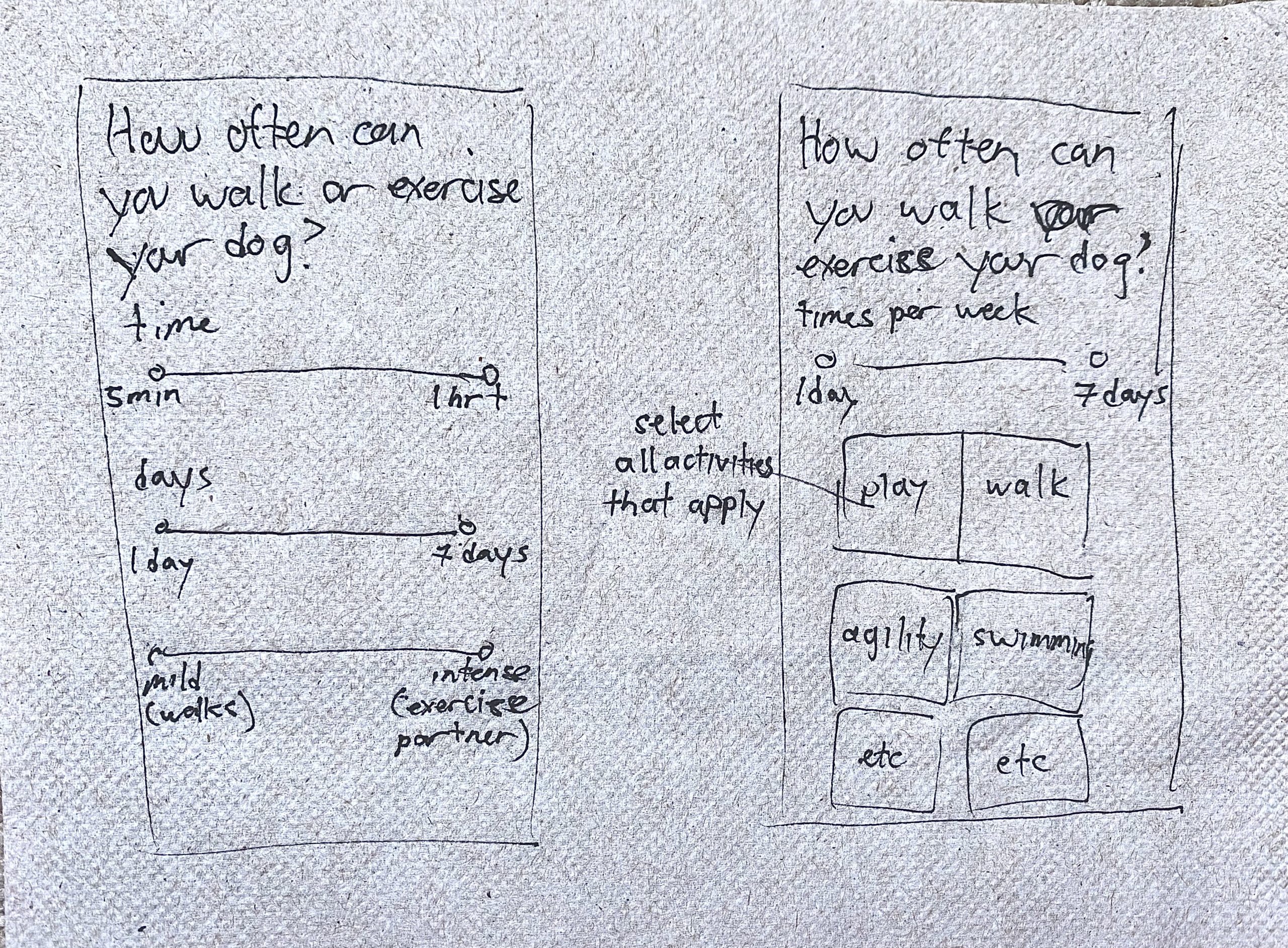
Rapid Sketches
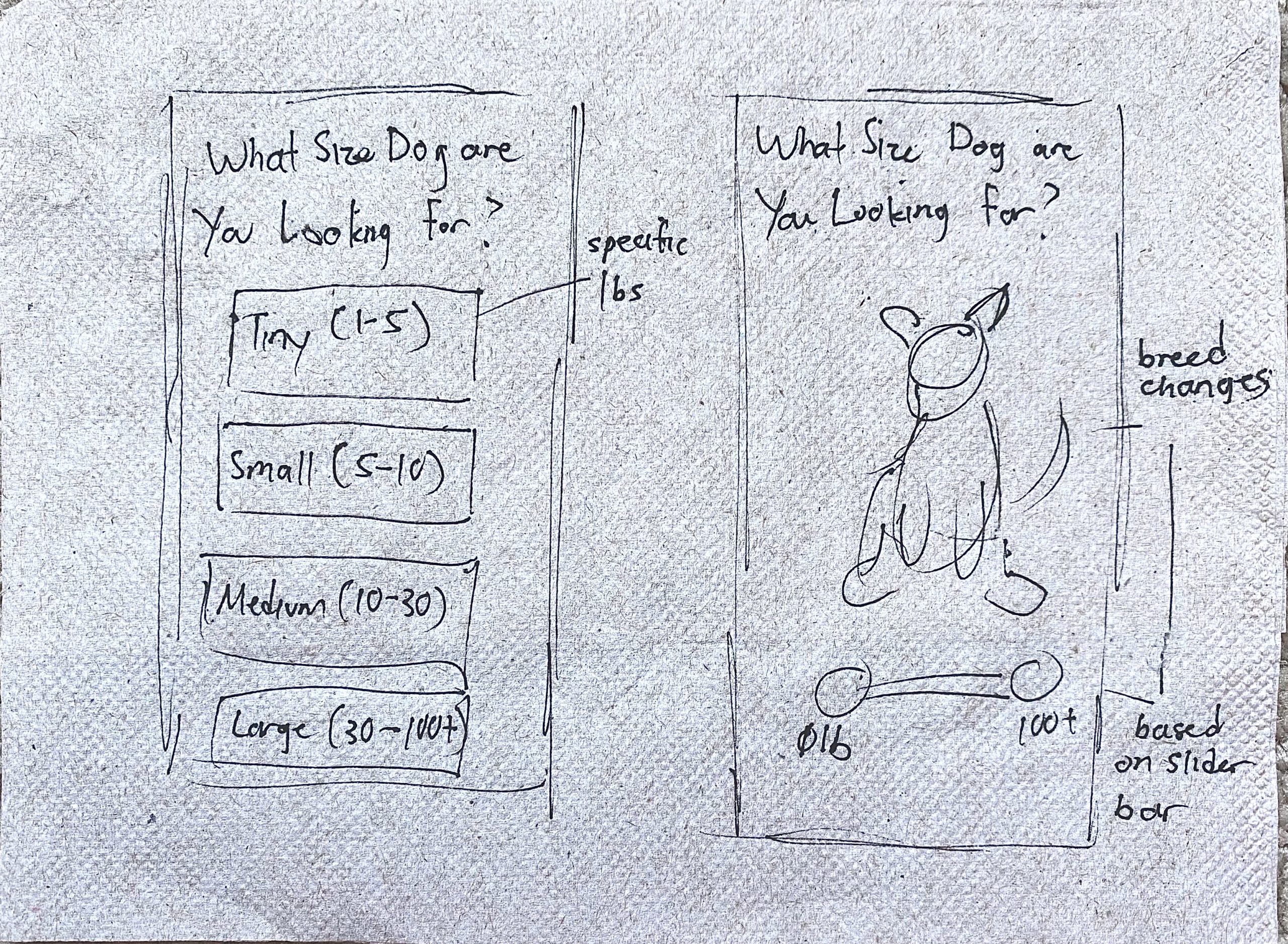
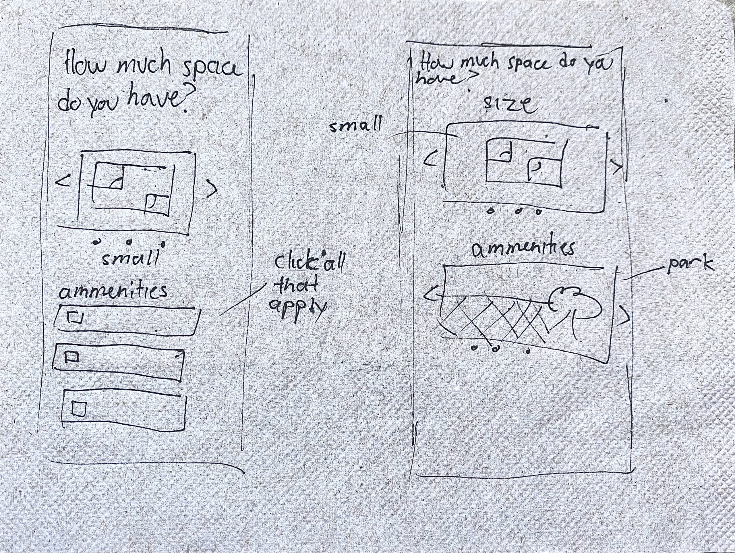
These sketches show various ways in which multiple options might be displayed. I believe that this would improve the experience because it would give Chelsea and other users the chance to accurately describe their living situation and preferences.
Final Wireframes
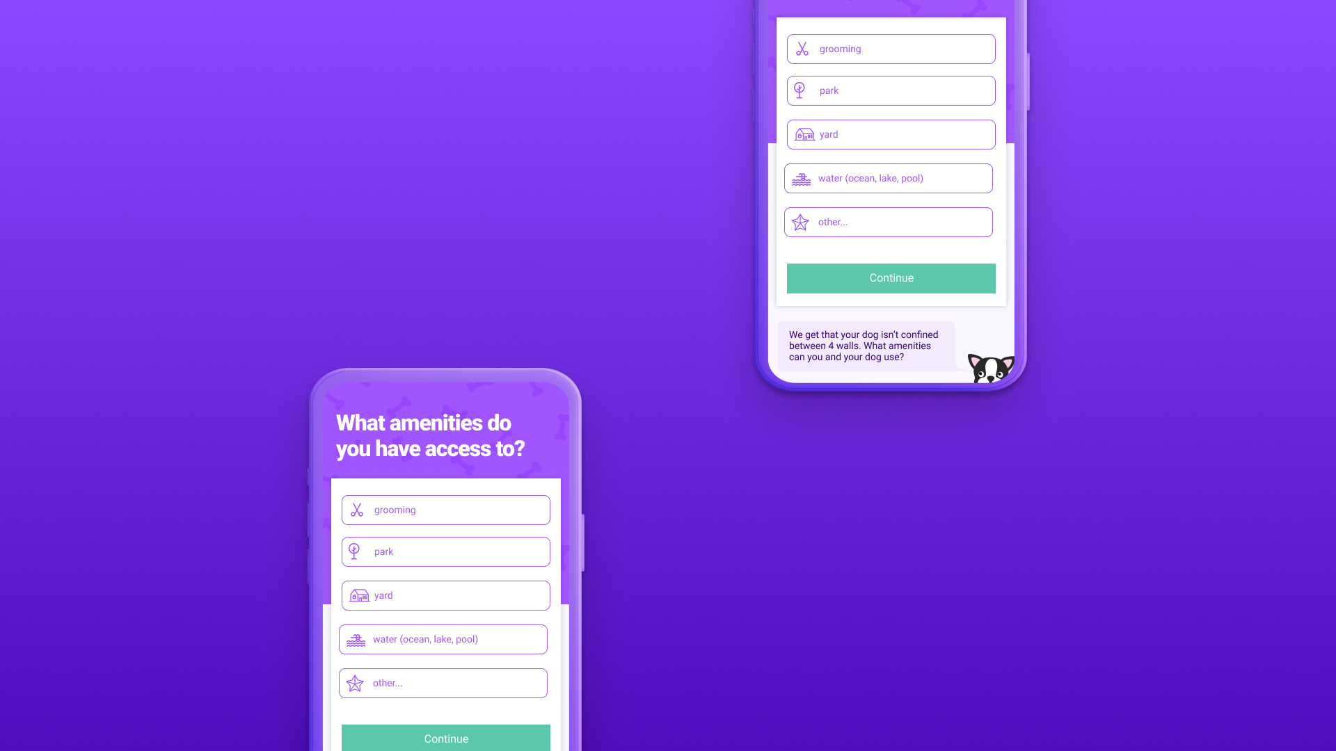
I sketched several new versions of the onboarding screens to show ways to improve some of the issues observed in the usability test.
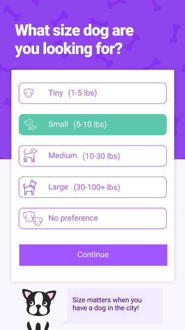
- Weight ranges are now included for each size
- "No preference" is added as an option
- Changed the paw print icon to a dog's face for more consistency
- Selection states are more clearly portrayed
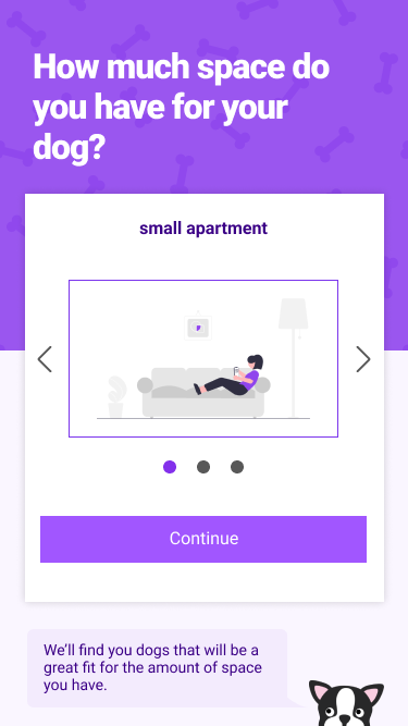
- Visuals of how a residence size might look are included
- The topic of space is split into 2 pages so the user feels accomplished for finishing a small task
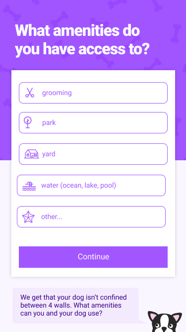
- Changed to check boxes for more options & user freedom thus translating to having better-curated matches
- This selection style is used for other question(s)
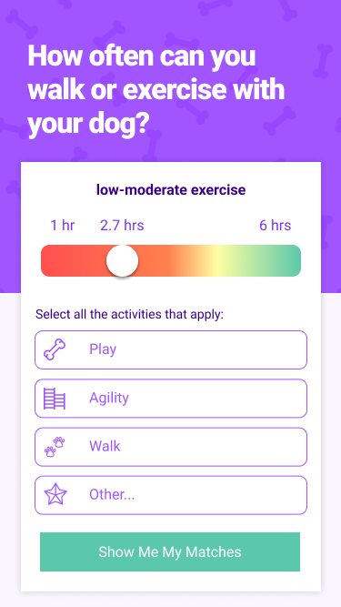
- As hours of activity are changed on the slider, the type of activity changes
- The speech bubble & dog were omitted to make room for more activity options
- Improved consistency in button design by having all the “continue” buttons purple & the “show me my matches” remaining green to signal the end of the questionnaire
Next Steps
- I would like to finish the entire onboarding process (from sign-up all the way up to the results page)
- Do user testing on the redesigned screens and make changes accordingly
- A skill I would like to get better at is doing quick sketches that implement UX UI principles & laws that are proven to help users
